My journal has a survivorship bias. If you skim through the years, you’ll notice detailed entries during slow, uncertain periods, capturing the mundane well-documented. But the times when everything was actually happening – when I was neck-deep in meaningful design leadership work – those pages are nearly empty, with only a sketch or diagram here and there. Then there’s a gap of three months followed by a retrospective written from the other side. Survivorship bias works the same way – we study the companies that survived, not the thousands that quietly failed.
What survives is the stillness. The true action happened off the recorded pages.
The gutter is where the story lives
Think of it, exactly how comic strips work by showing a character in one panel and then in the next panel, at the door. The space between these panels, called the gutter, is where the reader mentally fills in the missing action or transition. This gutter is where the story actually lives.
My blank journal quarters are gutters. They signify the shift from one state to another – before and after, setup and result – with almost no content in between. From the outside, they look like absences. But from my perspective, they are full of meaning and change.
A whiteboard and a work shadow
One of those gutters started at my whiteboard. I have a whiteboard in my room where I sketch and explain – it is where many ideas have started, and I suspect my team has learned to pay attention when something goes up on it. I love working with whiteboards. Being able to draw, erase, and redraw on the spot, especially with someone else in the room, is where the best thinking happens. That day, I was explaining to a work shadow how a product development organization is structured – where UX professionals work, what they do, how the matrix of products and channels creates different needs for different teams. I sketched as I talked: product tribes as columns, channel tribes as bars, and their intersections as crossroads.
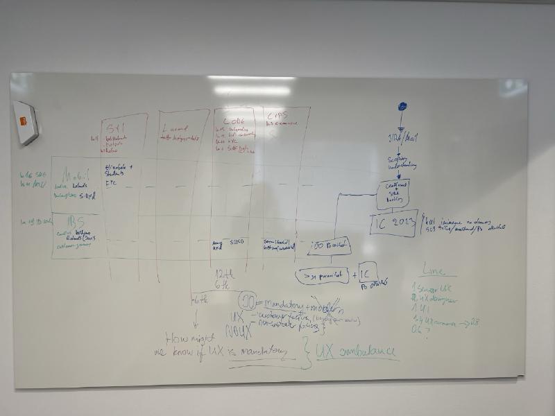
In the middle, I crossed out the intersections. Products and channels have fundamentally different orientations – products are sales and conversion-focused, channels are about consistency and reliability – and this means they need different things from designers and researchers. The moment I redrew the diagram, something became clear that I had never expressed that way before: I could see exactly which tribes had no UX coverage at all, despite working on products that mattered. And I could see the logic of how that coverage should work.
The clear difference in goals and needs was the telling sign. Even as I explained it to someone else, I felt the particular joy of a sketch clicking into place. I had accidentally drawn something important.
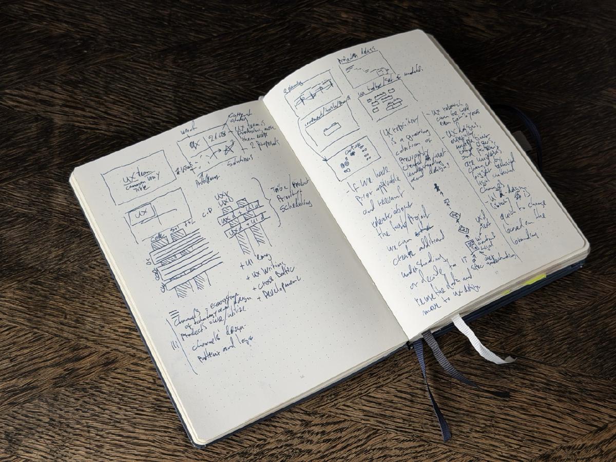
What the sketch showed
The sketch also revealed a quieter insight: implementing a universal design system could benefit both public and internal surfaces, allowing colleagues within the organization to enjoy the same design quality as customers. Not just those outside. Only this last realization significantly reduced development costs and dependencies across teams. I shared the drawing with my mentor, who found it interesting – and sometimes, that’s enough.
What followed was a quarter with almost no journal entries.
A quarter with almost no journal entries
The presentation that didn’t go well
The final presentation, which was meant for all tribe leads (heads of product teams), didn’t go as planned.
My manager suggested a specific message structure. I didn’t have time to review it with her before the meeting, so I trusted her input and followed it. The sequence felt unfamiliar, and the framing was different from what I had rehearsed. Somewhere in the middle, I lost my train of thought. I knew the material and believed in the plan, but my communication collapsed in the presentation.
Despite this, the plan was approved, and we moved forward.
Later, I realized that what I had built was also a gamble. The previous situation was bad – planning conflicts each quarter and coverage gaps nobody had solutions for. My model was an improvement over continuing as before, which was a lower bar than I had fully admitted. I learned that I should either trust my material completely or rehearse aloud until I internalize someone else’s structure. Using a mirror is more helpful than I had thought.
What I left out
Some months later, once the gap had closed and I resumed writing, it came as a flood – pages of reflection and a hint of regret that I hadn’t captured any of it chronologically. I wrote several pages about that quarter.
I didn’t mention the tribe lead presentation.
What interests me now is that even a private journal, written for no one, only contains what you’re ready to keep. The bias exists in both the archive and the creator. I processed the quarter through writing, but I avoided the moments I wasn’t ready to document. I noted the outcomes and lessons learned, but left out the stumbles.
What the gap made
What the model produced in the years that followed made that omission seem less significant. The issues that once caused friction around design coverage – gaps, overlaps, and quiet territorial disputes that drained organizations of energy – became, over time, almost unrecognizable in scale. Colleagues in the Baltic teams started collaborating on work that was improved by its scope. The model became an integral part of how the organization saw itself.
And I learned through these experiences that seemingly conflicting interests usually aren’t in conflict, if you’re willing to find the level where they meet. That understanding became the seed of an interest in mapping design practice as a business model, in measuring the value of design in addition to aesthetic terms, also in business terms.
The gap gave me the confidence.
A new gap, and a different kind of confidence
I’ve been in another gap since last August.
The organization has changed. The UX team has grown in size and maturity, and rapid technological advances mean we need to keep evolving – adjusting what we do and how we do it. What I am working through now is a question that sits underneath all of that: where responsibilities and accountabilities for high-quality design work need to be explicitly clear. And in the long term, I am designing a process that keeps humans at the center of critical design and development steps.
This feels different from the inside. The situation is VUCA – volatile, uncertain, complex, ambiguous – but I find I’m not frightened by it. I know I have overcome this before. I know where we need to go, and I understand that reaching that point requires patience, skill, and the ability to hold ambiguity without prematurely collapsing it. I believe I have what is needed.
The first gap ended with confidence. This one began with confidence already in place.
At times, it feels like play. I know I love adrenaline, the environment suits me.
That’s the pattern
I’ve also started writing again, intentionally this time: not for memory or documentation, but to clarify my thoughts – similar to how a whiteboard sketch made while explaining something can reveal a logic I never previously expressed. This form of deliberate writing and professional reflection is where I develop ideas that no meeting or presentation can generate. The writing is the process, not just a record of it.
That’s the pattern – energy used in action leads to periods of silence, and energy returns as writing resumes.
The empty pages were never truly missing. They are evidence of effort. When the notebook is silent, something is brewing. When it opens again, you come back – ready to interpret what was created in the silence.
And when you return to the page, the person writing is never quite the same as the one who last put the pen down.
In a gap right now?
If you are between chapters – carrying something you have not named yet, or sensing a shift you cannot quite see – that is where coaching does its best work.
Talk this through with me