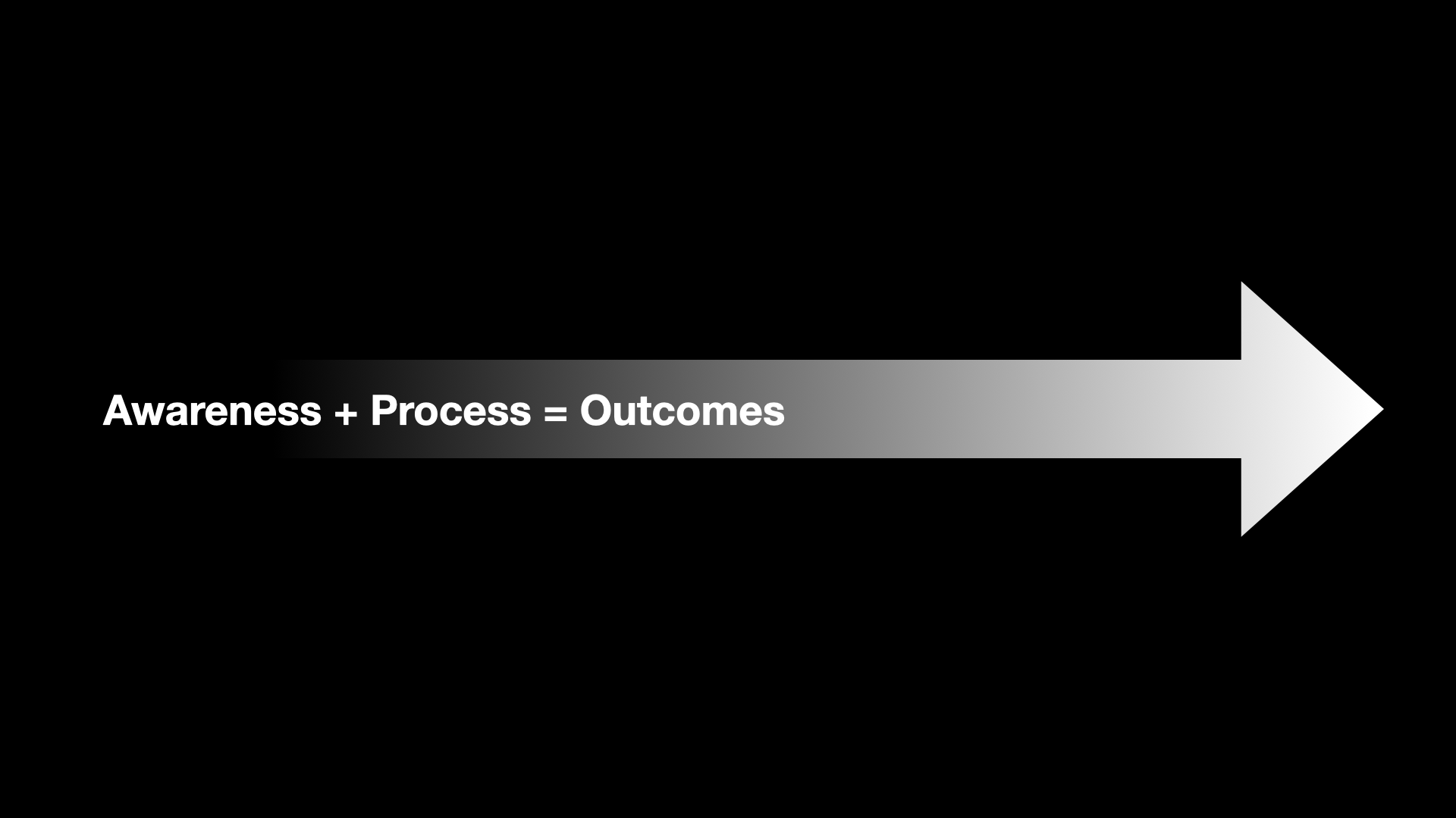
The trinity of metrics framework
Vague directives to “improve the UX” waste resources and miss the underlying issues affecting both customer experience and business outcomes.
The general statement “poor UX” without specifics often leaves design teams to define – and sometimes fantasize – what needs improvement. This inefficient approach frequently misses the issues affecting customer experience and business outcomes.
Over time, we noticed interesting correlations when combining analytics with customer experience evaluations. Particularly intriguing were scenarios where usability tests showed solid results, but usage dropped significantly in live environments. Based on these insights, I began experimenting with a measurement system based on customer journey phases.
The breakthrough came when we started mapping three distinct measurement categories across each customer journey phase.
By connecting what users experience, how systems perform, and what business value is created at each journey stage, we gain unprecedented clarity about where to direct our efforts.
Customer experience metrics
Understanding how customers perceive and feel about their journey is the foundation of effective design.
- NPS is less effective, as it represents general sentiment about the whole organization and cannot be translated to specific products or phases.
- CSAT measurements tied to specific journey phases provide more valuable insights. For new products, we collect general impressions; for existing products undergoing improvements, we track sentiment before and after updates. As we know which phase was updated, changing CSAT trends signals our work impact.
- Usability tests provide valuable insights but are costly and require interpretation.
Technical performance metrics
Friction in the system creates frustration for users and missed opportunities for businesses.
- Completion times reveal friction points in the journey
- Bounce rates identify where users abandon journeys entirely – a critical signal of fundamental problems
- Attempts show how many times users try to complete an action before dropping – a clear signal of strong need combined with quality issues
- Form validation error rates pinpoint specific interface problems
Business value metrics
Numbers speak louder than opinions when proving design’s impact to stakeholders.
- Completion rates directly correlate with captured business opportunities
- New sales connect design improvements to revenue outcomes
- Customer lifetime value indicators help us prioritize improvements that affect long-term relationships over one-time transactions
By mapping these metrics to journey phases, we’re creating a powerful tool for identifying exactly where to focus design efforts for maximum impact.
Advance your career and leadership
Subscribe and get actionable insights sent to your inbox.
- Practical frameworks from years of experience
- Case studies and implementation guides
- Career development strategies for professionals
I respect your privacy. I will never share your email, and you can unsubscribe anytime.
Customer journey as the organizing principle
Without a clear journey framework, measurement becomes a collection of disconnected data points rather than a strategic narrative.
We structure our measurement framework around six key journey phases that may occur in different orders, repeat, or be omitted depending on the specific product and user. Adapted from the approach described in “Build What Matters”1:
- Trigger – An event that prompts the user to search for a solution to a new problem or a replacement for an already existing solution.
- Discovery – The user actively searches for a possible solution. Searches from the internet, asks from friends, and recalls memories.
- Evaluation – The user has found multiple solutions that will be checked based on mental checklists. Tries to understand if it would be a good solution.
- Trial – The user decides to try several options. Some will be dropped in seconds, while others will be used for longer.
- Usage – The user has moved on and continues using one solution that has solved the initial triggering event and may be even more valuable.
- Decision – This is when the user has to decide whether to continue using or drop the solution actively.

These phases provide a consistent framework for evaluation across different products and personas. With this structure in place, we can clearly identify where experience problems occur and measure their business impact.
When every team member shares this common language of journey phases, communication becomes clearer and decision-making accelerates.
From insights to action
The true power of this framework lies in its ability to pinpoint exactly where to focus limited design resources.
As we can see where customer acquisitions for new products and usage rates drop, we know where to focus our efforts on a smaller scope. This information points towards specific phases in product usage journeys and scales up to indicate which product portfolios require more attention. Organizational business goals and evident improvement opportunities now directly guide our product development and design priorities.
For example, in one application of this approach, we noticed usage drops in a specific area for one of our products. This insight came from analytics, prompting our UX designers to investigate the root cause. The team interviewed users and conducted observations to gain detailed information.
Users perceived our legal obligation to collect a set of pre-defined answers as redundant and intrusive.
We were limited in how we could improve the form experience. To overcome this, we experimented by adding an extra communication step to the flow, designed to change people’s attitudes toward the required steps ahead. This approach leveraged the Zeigarnik effect2 by convincing users that the process was nearly complete. The change was effective – completion rates improved and dropout rates decreased.
This example shows the value of data-driven decisions focusing on evident issues rather than seeking opportunities at random. Without our measurement framework, we might have attempted broader redesigns that wouldn’t have addressed the specific issue.
Without this targeted approach, organizations waste resources on broad redesigns when strategic intervention would be more effective and measurable.
Visualizing the impact
Translating complex measurement data into intuitive visualizations transforms how organizations perceive and value design work.
For stakeholder communication, I show the ideal state of the visualization dashboard’s intended vision. Using a consumer loan example:
- The trigger is outside our direct control, but we can prepare for the discovery and evaluation phases based on customer research insights
- In the evaluation phase, users reach our website and potentially use the loan calculator
- The calculator represents the trial phase where users evaluate options
- When users proceed to complete the application form, they enter the usage phase
- Receiving an offer and choosing whether to sign the agreement is the decision phase
- The relationship continues through another usage phase until the loan is paid off, leading to another decision point where we aim to retain the customer
We track customer satisfaction, business value (with drop-offs represented as financial losses), and key technical metrics like bounce rates for each phase and the entire product.
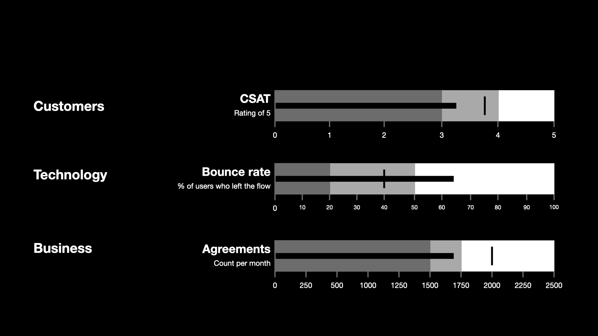
For visualization, I test bullet graphs3 – linear data visualizations that display quantitative measures against qualitative states. By combining visually understandable customer journeys with these metrics, I can clearly communicate where the UX team directly influences business value generation.
When stakeholders can see both the problem and the opportunity in financial terms, design priorities shift from subjective preferences to strategic imperatives.
Organizational impact and implementation challenges
Implementing this approach requires structural and cultural shifts, not just new measurement tools.
A user research team regularly conducts strategic customer research activities.
Even as UX designers are allocated to various projects, I can dedicate 25% of their productive time to other value-generating initiatives, such as research activities for strategic insights. This arrangement is unique within our organization.
While conceptually straightforward, implementing this measurement system is a challenge. Mapping customer journeys and connecting them with appropriate metrics requires effort. Though we have access to the necessary data, efficiently collecting, processing, and presenting it is our primary challenge.
Additional complexity comes from products serving multiple customer personas, each with different journey patterns and corresponding metrics. Currently, we’re mapping customer journeys for various products as a critical preparation step while collaborating with stakeholders to secure support for further development.
I’m focusing on establishing the foundation of the metrics system before exploring technical capabilities for further automation and development. This initiative is strategically important for developing a mature, customer-centric product organization.
The effort invested in building this measurement foundation pays dividends through faster decision-making, clearer priorities, and stronger cross-functional alignment.
Moving from subjective to strategic design
When design speaks the language of business, it moves from a service function to a strategic driver.
By translating product journey into monetary terms, we’re developing a powerful tool for demonstrating design’s true business value. Each successfully passed phase brings us closer to profit, while each dropped completion represents a potential lost business opportunity.
This translation to monetary terms is key in business settings, signaling the totality of design value in the organization. When we identify multiple issues, we can decide whether to focus on phases with the largest drop-offs and evident customer dissatisfaction or address the earliest phases of the journey.
Combining customer journeys with our trinity of metrics, we transform design from a subjective “beautification” function to a strategic driver of business outcomes. Our experience shows that the true measure of design’s value lies in the business results it delivers, one customer journey phase at a time
Organizations implementing this approach won’t just improve their design – they’ll fundamentally transform how business decisions are made, with design leading the way.
Foster, Ben, and Rajesh Nerlikar. “Build What Matters: Delivering Key Outcomes with Vision-Led Product Management.” Prodify, 2020. https://www.prodify.group/resources/book ↩︎
Yablonski, Jon. “Zeigarnik Effect.”" Laws of UX. https://lawsofux.com/zeigarnik-effect/ ↩︎
Few, Stephen. “Bullet Graph Design Specification.” Perceptual Edge, 2013, https://www.perceptualedge.com/articles/misc/Bullet_Graph_Design_Spec.pdf ↩︎